Segmentation
Segmentation feature allows you to analyze and get insights from your data by drilling into individual and multiple dimensions. It leverages the measures, dimensions, and relations between the models. If you are analyzing the event data, segmentation can be used to create event metrics or if you're familiar with the term OLAP cubes, segmentation enables you to drill-down into your OLAP cube.
We automatically select the chart depending on the values of the report but you can change the chart type and customize the series as you wish.

Segmentation query builder
Model
You need to select the model in order to be able to create a segmentation report. If you have eventTimestamp mapping for the model, you need to set the date range from the picker in the menu which will be filtering the data by eventTimestamp dimension. Once you set the model, the other features such as measures, dimensions, segments, and filters will be activated based on the relations of the base model.
Measure
If you want to calculate a metric, you need to set at least one measure. Measures are optional but if you don't have any measures, you need to have at least one dimension meaning that you want to show the distinct values of the dimensions.
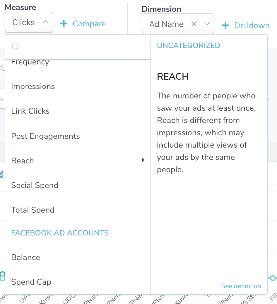
Measure dropdown
We categorize the measures based on the category and the relation name and list all of them in the dropdown. If the measure has description, you can use the side panel in order to understand what that measure for. In charts, measures are typically the values in Y-axis because measures are being used for aggregating the data under the hood.
Please note that you can select more than one measure in order to compare the values.
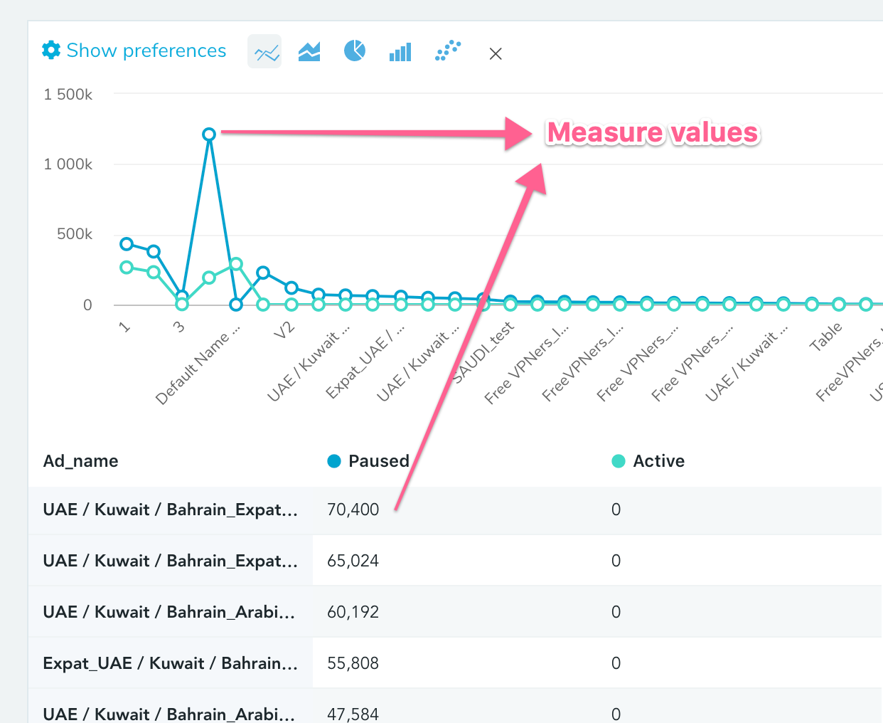
How you see the measures in chart & table.
Dimension
If you don't select any dimension in a report, you will only see one row in the table meaning that you're calculating the metric aggregating all the data in the model. In our previous example, we're calculating the number of clicks ads name so we will see the number of clicks for each ad when we run on Facebook. The number of rows will be equal to the number of ads that we have on our Facebook account.
Dimensions correspond to X-axis in the chart and they're the first columns in the table. We highlight the dimension using the different background color and making them pinned to the left side of the table. You can select more than one dimensions if you wish, the table will show you one column per dimension and the chart will concentrate on the values in X-axis.
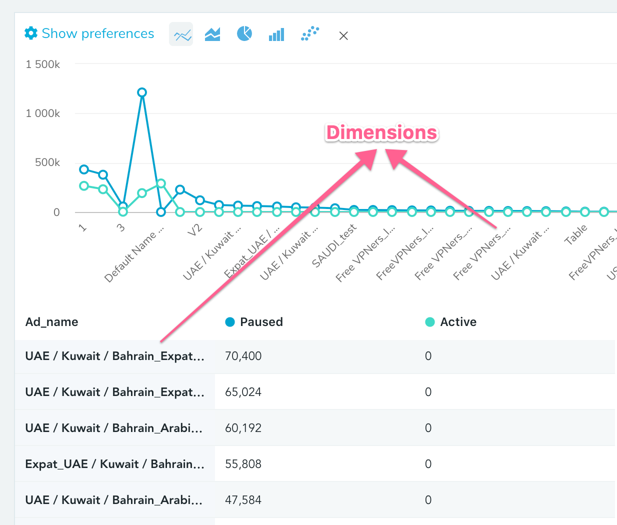
How you see the dimensions in chart & table.
The dropdown of the dimension is pretty similar to measure dropdown since they share the same concept.
Segment
In case you have more than one dimension, it may be hard to keep track of the measures across the dimensions that you selected so you can use one dimension in your report and move the other dimension into the segments section. The following report actually shows the same data but since we moved one of the dimensions into the segments section, the latter report is much more intuitive:
Since we have 2 dimensions, the chart concentrates the values so it's hard to keep track of the number of clicks for each day across the effective status of the campaign.
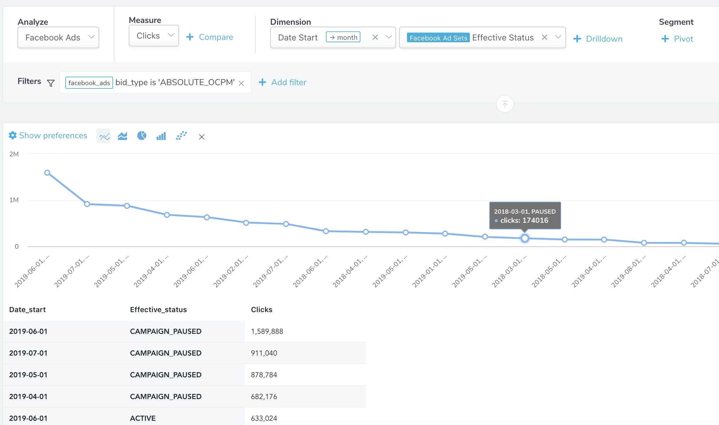
2 dimensions
Here, we convert all the values of the segment dimension into the column names which is called pivoting. As a result, the table has once column for each distinct value of effective status and the dimensions that we have selected. It's much more each to keep track of dates and see all the values of the segment for each dimension.
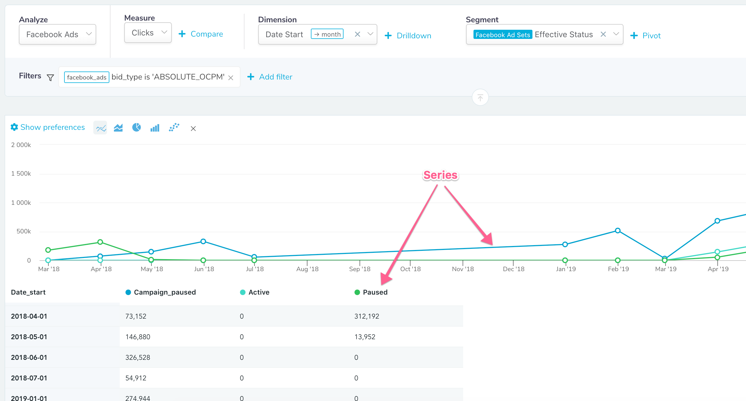
1 dimension and 1 segment. Series correspond to the segment
It's usually much more convenient to use continuous values such as dates in dimension section so that our chart shows linear values in the X-axis. In our chart, each value of the segment corresponds to one series which also allow you to compare them so if you have 2 dimensions where one of them is discrete the other is not, you can usually move the discrete one to the segments.
Filter
If you want to analyze a subset of the data, you may add filters for the data that you're analyzing. Here is an example:

A filter that uses both and. or
Once you select the dimension in the filter section, we show you the appropriate filter operators and suggest the values for the filter operations in the input section. If you need to an OR, you can press the plus icon right side of the filters but we use AND for filter across the dimensions. If you're confused about the filter, please see the info top of the filter which explains the filter in English.
Actions
SQL: If you're technical, you can click Export to SQL under the menu Export and see the underlying SQL query of the report.
Export data: You may wish to export the data as CSV or download the image of the chart. We limit the rows when running the query and allow you to export all the data in case the count of distinct dimension values is more than 5000.
By default, we cache the data when you run queries in segmentation page so if you run the exact same query twice subsequently, we show you the cached data. You can click the light bulb and force refresh if you wish.
Updated over 6 years ago
